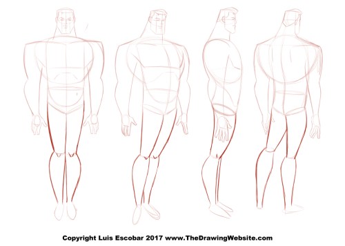
Cartoon Legs Formula
December 6, 2017 in Intermediate, Lvl 1
Cartoon Legs Formula

Arms and legs have a lot in common when it comes to drawing them. The thought process behind drawing them are very similar. The biggest difference between the two are the muscle masses.
Otherwise, the approach to both arms and legs have a lot of overlap as you will see.
In this lesson, we’ll be tackling:
- Simple Cartoon Legs
- Leg Drawing Formula
- How to Apply the Formula to Different Cartoon Styles.
Let's get started:
Simple Cartoon Legs
Cartoon legs can be simply broken down to rubbery rectangles or long triangles. After deciding the type of legs you will go with, you can then add dimension by making them cones or tubes.
Depending on the type of legs you choose to draw, you can bend them like a hose or you give can give them corners at the knees:
As well as making them thin, fat.
Of course putting straights versus curves is an appealing way to vary the type of line work on when drawing them.
Experiment until you find a variation that you like. Especially with very simple cartoony legs:
As is usually the case, it's only when you're going for a more naturalistic look that things start getting more complicated...
Leg Drawing Formulas
Now I'll breakdown a very simple formula for drawing legs. It's essentially the same formula for drawing arms. Just like with arms it's a straight or slightly tapered tube:
Just like with arms, when the legs bend you break up the tube into two slightly tapered tube connected at the bending point.
Again, just like with arms, in order to make sure the legs have an organic feel, it's a good rule of thumb to give the tube a very subtle curve of some sort. Either an slight “C” curve or “S” curve.
Once you have this foundation, you can start adding solidity.
The next step in an out stretched leg is to draw a shape to indicate where the kneed is located. I tend to draw an oval. I draw it, roughly, about half way between the top of the leg and where the heel of the foot meets the ground. I'm usually not really precise about this. I tend to "eyeball" it. In very cartoony characters this can be modified to any proportion that suits your leg design.
Second, turn the two graphic lines into a cylinder by adding directional lines. These lines show you the direction of the perspective of the leg you’re drawing. BE CONSISTENT. If you’re indicating that the direction of the leg is going in one direction, it’s impossible for you to see another part of the same leg going in the opposite direction, without it turning:
Once you have this foundation the rest comes down to your knowledge of human anatomy.
I won't go into the anatomy here. You can study that on your own for now, but I can give you a few tips.
As with arms, avoid symmetrical leg muscles. They tend to look very inorganic when they’re symmetrical. Instead, interlock the asymmetrical muscles as we did with the arms. In other words: Stagger the bumps:
And of course, you can't go wrong with designing Simple vs. Complex muscle groups:
Now let’s take a look at how this formula works in different styles…
How to Apply The Formula To Different Cartoon Styles
Using the formula above, all you need to is find the "rules" of the style you want and you can apply it to your basic foundation.
Freddy Moore Style
The Freddy Moore style has two type of legs, the Disney Feature type legs and the Looney Toons type legs:
- The Disney feature type are far more naturalistic. Muscle symmetry is avoided. They are simple, subtle and muscles are not overly defined.
- Looney Tunes type legs are far more simple. They're mostly just slightly tapered tubes. The exterior "C" curves are often more exaggerated than the interior.
Bruce Timm Style
Unlike the arms, The Bruce Timm lrgs are not quite “B” shaped, or at least they don't tend to be in most views or in most characters. They are sometimes. More often then not though, they look like this:
- The upper leg can be "D" shaped tapering as it get's to the knee. Once you get to the calves, they curve down on both sides. The curve on the exterior part of the leg being a big bigger than the interior one.
Female legs tend to be wider in the upper thigh area then male legs as seen below:
Takahiro Kimura Anime Style
The Kimura anime style legs are slightly more anatomical looking. It’s best when drawing them to know leg anatomy.
- Male legs tend to have more defined muscles then female legs in this style, which makes them slightly harder to draw. But they tend to be simpler on the exterior part of the leg than the interior.
And that's it for legs.


